Conversion rate optimization(CRO) is a method to increase sales without increasing traffic or ad-spend, simply by making changes to the website. 1 single eCommerce optimization probably does not yield noticeable improvements in conversion rate. We might be talking just about a 0.01% – 0.2% change. But, if you stack these small improvements over time, you could see a massive improvement in conversion rate.
Think about it – if you could improve your websites conversion rate just by 1%, from 1% to 2% – that would mean an increase in sales from 100% to 150%. For a 100k a month store that would mean an extra 100k – 150k revenue(without spending a single cent extra on ads).
Yes, it’s that important!
And fortunately, most of these changes require minimal investment in time and effort.
In this article, we lay out all the eCommerce optimization tips, that you could start implementing today.
But, first, let’s understand the basic principles behind eCommerce conversion rate optimization.
5 Key Principles To Help You Optimize eCommerce Store
Congruency
Make sure that all of your messaging is congruent – from the colors and images of your home page to the text on your product pages, everything needs to be perfectly aligned in order to create a cohesive user experience. This will help to ensure that visitors trust your site, stay on it longer, and are more likely to convert.

Trust
When it comes to online transactions, trust is key. If your visitors don’t trust your site, they won’t buy from you. This is why it’s important to showcase testimonials from happy customers on your website, as well as include security badges and other trust indicators. It’s also important to note – you should always use correct grammar in your product descriptions ( use Grammarly for that ).
Distractions
Keep your web design clean and simple, with no noisy or flashy distractions, no extra words or sentences to make it look “sophisticated”. This will make it easier for your visitors to focus on what you want them to buy. We live in a distracted world, where an average person sees thousands of advertisements per day, which makes them more distracted than ever. Your job, as an online business owner is to minimize the cognitive load, and make buying decisions for the customers as easy as possible. The fewer distractions = the more likely to buy from you!
Layout
The layout of your eCommerce store is another important factor that can influence conversions. Make sure that the most important elements are prominently displayed and easy to find. Place the most important elements above the fold(the top of the page users see when they load the eCommerce store).
Simplicity
K.I.S.S. – Keep It Simple, Stupid. You have probably heard of this phrase, but it can’t be more relevant in the context of website design and structure. When it comes to conversions, the simpler your site is, the more likely visitors are to stay on it and make a purchase. Remember – “perfection is achieved not when there is nothing to add, but when there is nothing left to take away.” So, get rid of all the clutter and keep your site simple!
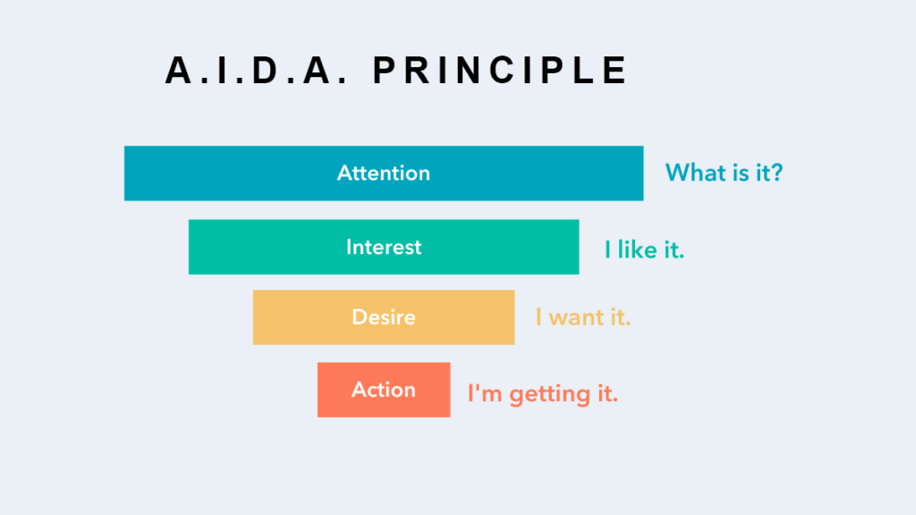
Use AIDA Principle for landing page structure
AIDA stands for Attention, Interest, Desire, and Action, and it is a formula that has been proven to work for advertising and marketing. When it comes to your website’s landing pages, you want to make sure that it is structured in a way that will grab your visitor’s attention, hold their interest, create a desire for what you are offering, and then urge them to take action. Here is an example of AIDA in action:
Attention: Start your headline with a catchy phrase or statistic that will get your visitor’s attention.
Interest: Follow the headline with a brief description of what you are offering and why it is of interest to your visitor.
Desire: Make sure to highlight the benefits of what you are offering, how it works, and how it will improve their life. Include your customer reviews here.
Action: Urge your visitor to take action by telling them what they need to do to get the offer. Use a short and concise message on the CTA button.
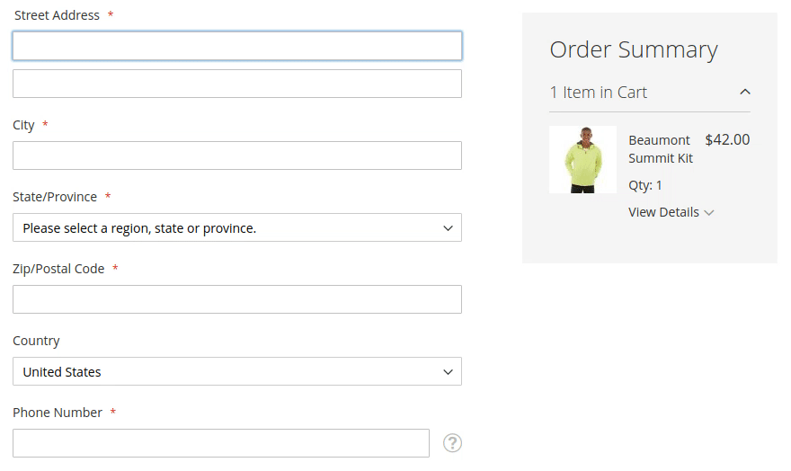
Auto-populate fields in the checkout
One of the main reasons for shopping cart abandonment is the time it takes to fill out all the required information. By auto-populating fields in the checkout process, you can help reduce this friction and increase your chances of completing the purchase. Shopify’s default checkout page already has this feature built-in.
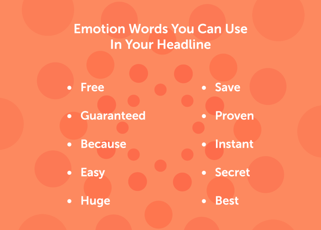
Use emotive headlines throughout your landing page
Emotive headlines are more likely to convert than statements or facts. You could also throw in some numbers/statistics where it makes sense. The first headline above the fold should spike curiosity, increase interest and leave them wanting more – no need to explain everything right off the bat.
Use more gifs instead of images
GIFs are more likely to grab a visitor’s attention than static images. They also help to break up the text on a page and make it more readable. GIFs can also be used to create an emotional response, which can help to increase conversions. Make the GIF related to the main benefits of the product. Keep the gif short and sweet, no more than 5 – 6 seconds.
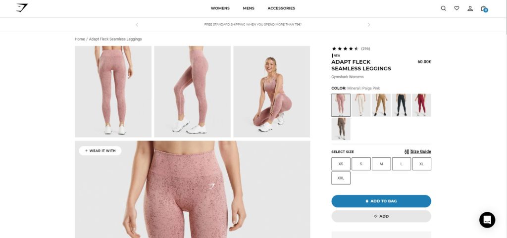
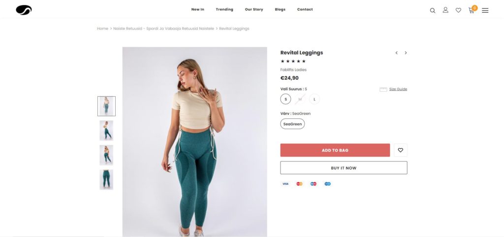
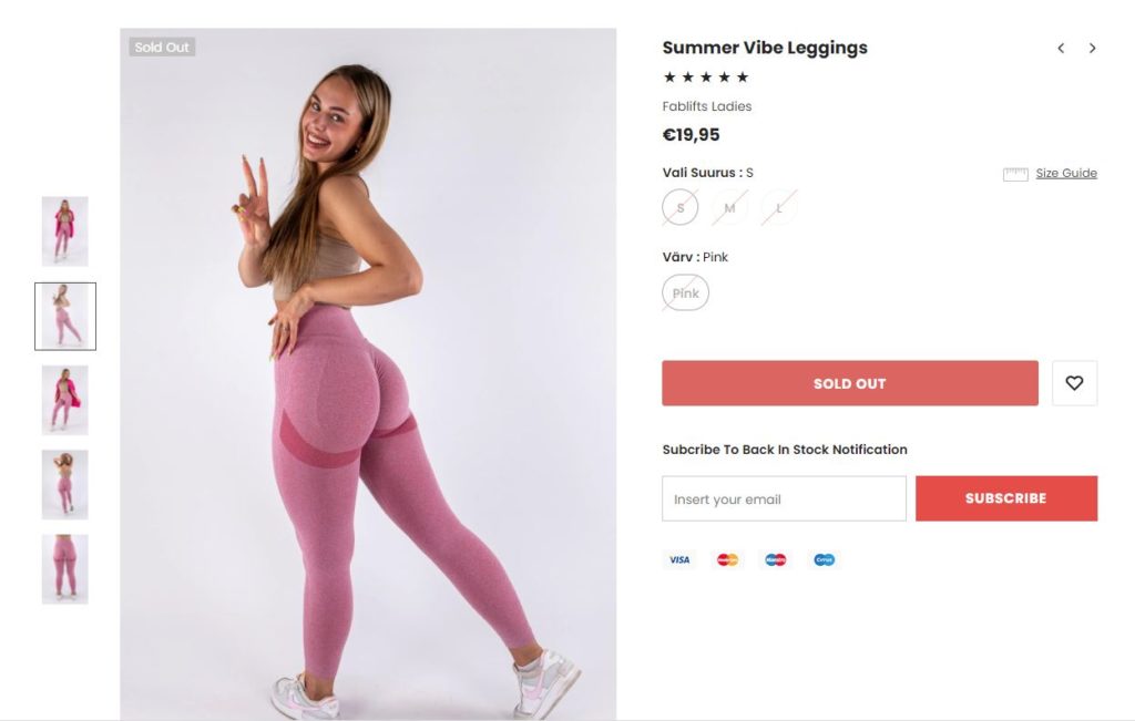
Use Authentic Product Images On Your eCommerce site
Your product image is the single most important factor in convincing people to buy. Product images should look and feel authentic – professionally taken with good lighting and re-touching(color correction, contrast, exposure, etc). You can also use lifestyle images to show how the product is used. Avoid using stock photos if possible, as they tend to look fake and unauthentic.
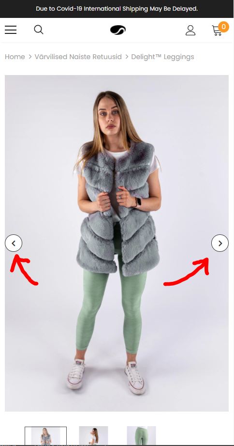
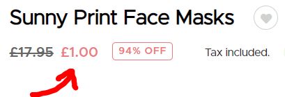
Use Arrow Pointers On Top Of Product Images
Arrow pointers on product images encourage people to engage with your website and browse your product images, which in turn increases chances of conversion.
Write concise & informative product descriptions
Your product description is your chance to sell the product and convince the visitor to buy. Write concisely, using clear and simple language. Use bullet points if possible.
Make sure to list all of the features and benefits of the product. Use the PAS framework: Problem-Agitate-Solution is one of the most commonly-used frameworks for structuring persuasive messages for problem-solving products. An example of a persuasive product description for the famous posture-corrector:
“Do you often find yourself feeling tired and lacking energy? Are you struggling with persistent back or neck pain? If so, our posture corrector might be the perfect solution for you! Our device gently pulls your shoulders back and aligns your spine, giving you the energy and relief you need to feel your best. You Don’t need to suffer from poor posture any longer – try our posture corrector today!”
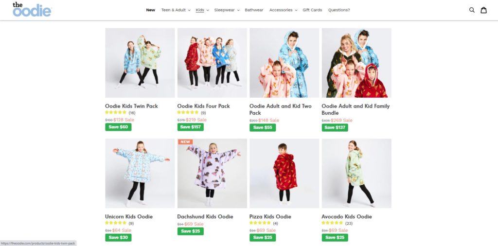
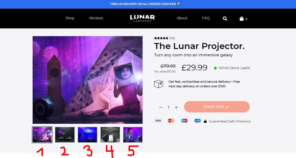
Use Multiple Product Images in Your Online Store
People are visual creatures, and they love seeing images of the product they are considering buying. It’s best to use multiple images to show off different angles, closeups, and features of the product.
Use a combination of lifestyle and product images to create a persuasive argument for buying the product. Aim to include at least 3-5 images per product.
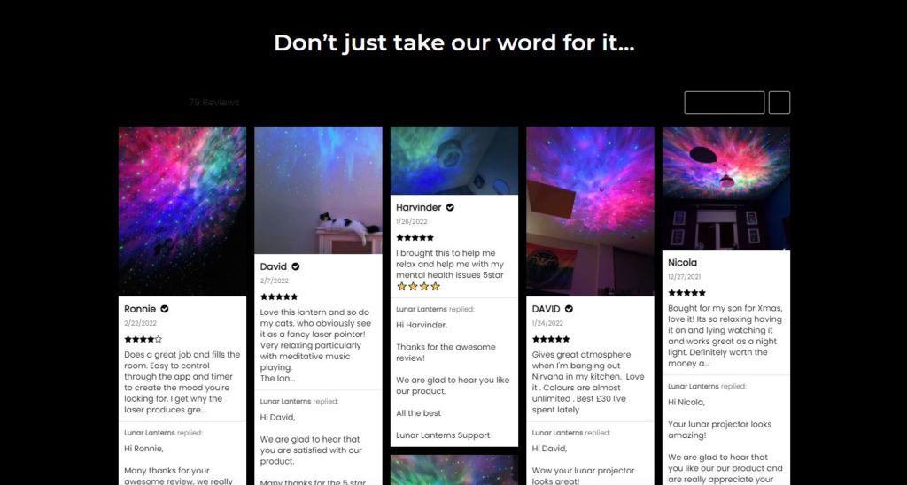
Use social proof – customers reviews
Always use a full review with a photo. This exponentially increases trust. People are social animals and trust in the opinions of others – especially people with similar views, challenges, and lifestyles.
Displaying customer reviews on your website is the second-best option to actual recommendations by a trusted friend or a family member. Customer reviews can increase the conversion rates on your website by up to 270%.
Some tips to increase the effectiveness of customer reviews:
-Make it easy for customers to find the review section of your website.
-Regularly ask paying customers to review your products or services.
-Include customer photos and a name with each review
-Respond to negative reviews (and thank customers for positive ones!)
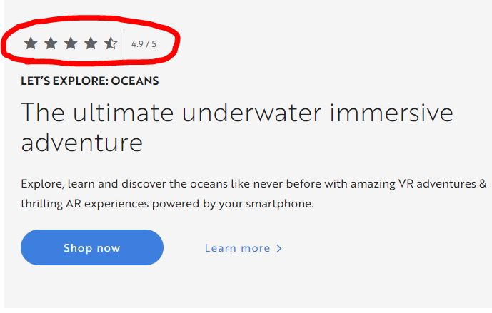
Add A Star Rating and the number of reviews above the fold
Placing the star ratings and number of reviews above the fold will increase the chances that people will actually see and read them. And the more people read reviews, the more likely they are to make a purchase! It all trickles down to the fundamentals – trust.
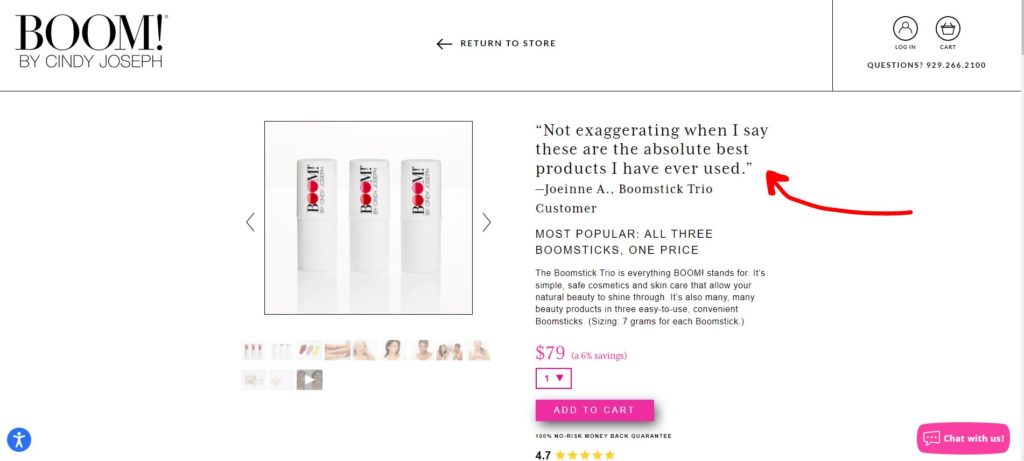
Have a testimonial ABOVE THE FOLD on your landing pages!
In addition to showcasing a basic star rating, you could double down on the social proof strategy and include a full review of a customer (including the customer image) above the fold (right beneath the star ratings). This further increases the trust and shows that other people have had a positive experience with your product.
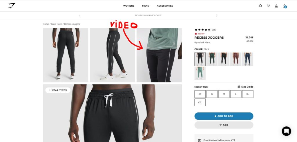
Include a video on your landing pages
A video can be a very effective way to convey your message and increase conversions. It can help to explain the product in more detail, show how it works, or just create a more personal connection with the viewer. If an image says a thousand words, the video says a million!
Optimize Keywords For Search Engines
When people are looking for a product, they often use search engines to help them find what they’re looking for.
Metadata is the information that search engines use to index and rank your website. You can optimize your website by using the relevant target keywords in your meta title (s), descriptions, and on-page content.
This will make it easier for people to find you when they’re conducting a product search. For extra SEO juice, use long-tail keywords (3-4 words) rather than single words. Some great tools for keyword optimization are Google Adwords Keyword Planner, Ahrefs, and SEMrush.
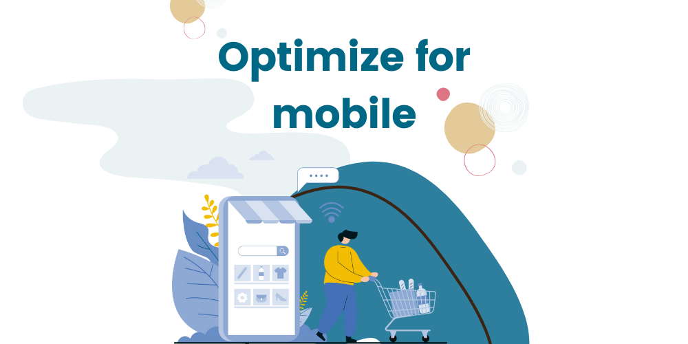
Optimize for mobile devices
Roughly 80% of traffic to eCommerce sites comes from mobile users. This number is only going to continue to rise in the coming years, so it’s essential that your website is optimized for mobile-friendly viewing.
Use a responsive design that automatically adjusts the layout of the website to fit any mobile version and screen size. Ecommerce platforms like Shopify, Woocommerce, and Bigcommerce have built-in responsive design features, so you don’t need to worry about having a separate mobile website. If you are building a storefront from scratch, make sure to use a responsive template.
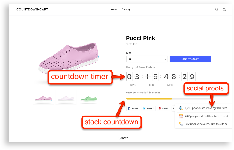
Use Urgency & Timers sparingly
Timers can be a powerful tool for pushing urgency and creating that impulsive tension towards the sale. A few years ago drop shippers started to over-use timer functionality, which resulted in most people becoming desensitized to the urgency tactic.
When used sparingly, timers can still be an effective way to increase conversions for specific holidays and flash sales, but avoid using them all the time as it will have the opposite effect.
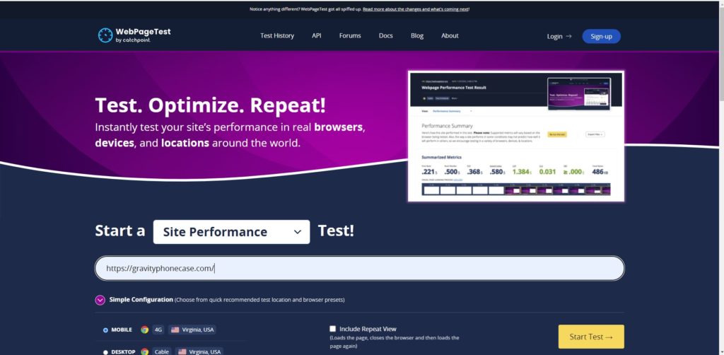
Optimize for site speed
Your website’s loading speed is another important factor that can influence conversions – make sure to optimize your images and code for the best performance.
Do not use excessive amounts of apps – it’s better to pick a theme that has already the full functionality of how you want your website to look. Check your website’s loading speed with tools like GTMetrix, Pingdom, and WebPageTest.
You can also use Core Web Vitals to track your website’s uptime & performance, as well as receive alerts for outages and slow response times.
Use card payment seals or Trustpilot star rating under your CTA buttons
It all comes down to trust – if your visitors don’t trust you, they’re not going to buy from you. That’s why it’s important to use seals or badges that show your site is trustworthy. You could also use Trustpilot’s star rating system to increase trust even further.
Keep your CTA-s consistent throughout the landing pages and entire eCommerce website.
The CTA (call to action) is the most important element on your landing pages – it’s what tells your visitors what you want them to do. Make sure that your CTA buttons are consistent in color, size, and location throughout your website.
Use A Sticky CTA
A sticky CTA is a CTA that stays in one place as the user scrolls down the page(usually at the top or the bottom of the page). This makes it more likely for your visitors to click on the CTA since it’s always in their sight.
There are many free and paid sticky CTA apps in the Shopify app store. Some themes have already built-in functionality for sticky CTAs.
Use Relevant Emojis On Your CTA-s
Emojis have become an important part of online communication and can be a powerful tool for increasing conversions. They add personality to your website, help to direct attention, and convey your message in a more engaging way.
Use relevant emojis on your CTA buttons to increase clicks. One of the best emojis to use on your CTA is a pointing finger emoji 👉.
Use A CTR Color That Contrasts The Rest Of Your Landing Page
Your call-to-action button should be always visible wherever the user is currently scrolling on your landing pages. That’s why it’s important to use a color that contrasts the rest of your landing page – this will ensure that it always catches the user’s attention.

Skip Cart Page
One way to increase your website’s conversion rates is to make sure that customers do not have to go through the cart page in order to complete a purchase. It makes the checkout process quicker and easier.
Although a cart page is a good way to offer upsells and cross-sells, it can often be a barrier to purchasing. Don’t take this as a definite answer – figure out if it makes sense for you to have a cart page or not.
Do Not Use Social Sharing Links
Sharing buttons can often be a distraction from the main goal of your website – to make a sale. If you really want to offer social sharing buttons, place them in a less prominent area of your website or use a pop-up window. According to statistics, very few people actually click on social sharing buttons, so it’s not worth distracting your visitors from the main goal of your website.

Embedding Facebook comments is a Bad Idea
Embedding Facebook comments on your website can have a negative effect on your conversion rates.
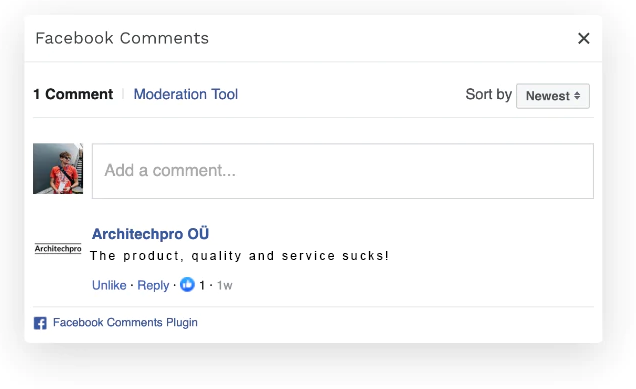
Studies have shown that people are less likely to buy from a website that has Facebook comments embedded in it. This is because they often lead to spam and negative comments. If you really want to embed comments on your website, make sure that you have a moderation system in place.
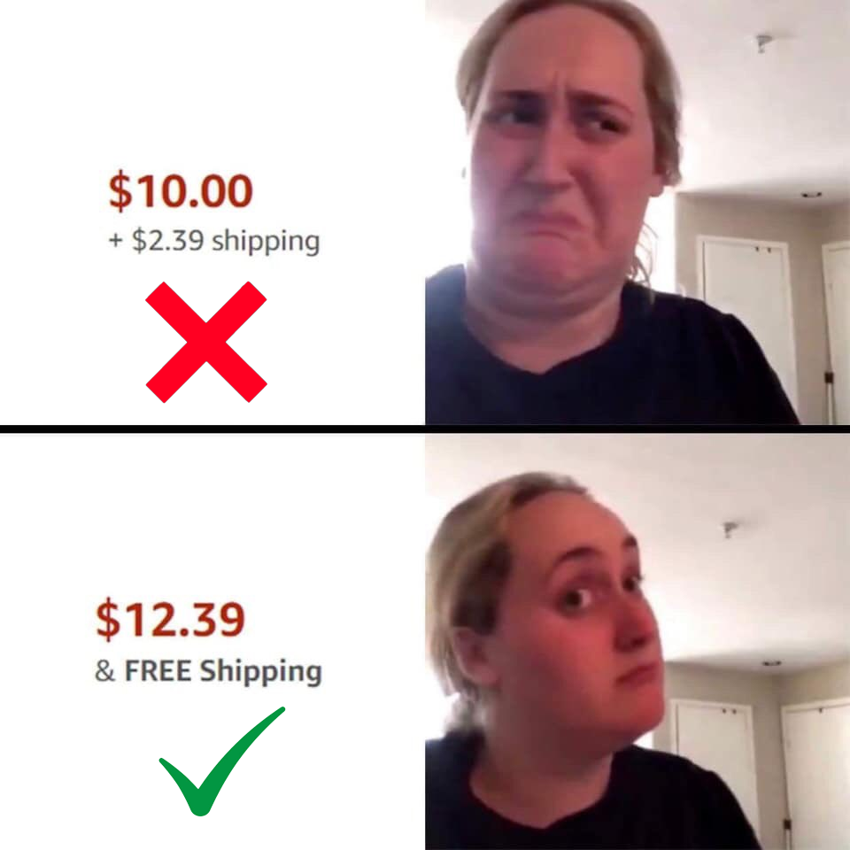
Offer FREE Shipping
According to statistics, almost half of all online shoppers abandon their carts because of high shipping costs. FREE shipping is one of the best ways to increase your website’s conversion rate.
For every extra dollar in shipping costs, there is a corresponding decrease in purchases of 2-3%. For example, if you’re selling a product for $100 and your shipping costs are $10, then you can expect about 20% of people to buy the product. If you were to offer free shipping, then that number would jump up to 50%.
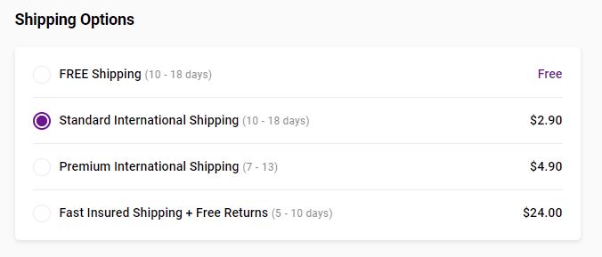
Offer Different Shipping Options
Whatever you are currently offering for shipping, it’s always smart to include at least 2-3 options for shipping. Some people expect faster shipping and are willing to pay for it.
About 60% of shoppers prefer FREE shipping but always offer a paid option too. Here are some ideas on how to structure your shipping offers:
- FREE shipping for orders over $50
- FREE shipping for orders over a certain weight
- FREE shipping for local customers
- Offer fast shipping. Partner with third-party logistics providers (3PLs) and leverage their fulfillment networks to meet the demand of consumers for fast shipping.
- Offer insured shipping. This will give customers peace of mind and assurance that their products will arrive safely.
- Offer bundled shipping. This is a great way to offer a discount on shipping for customers who purchase more than one product.
- Offer premium shipping + FREE returns. This will show your customers that you’re willing to go the extra mile for them.
- Offer international shipping. This is a great way to reach more customers and increase your website’s conversion rate.
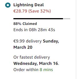
Display Shipping Times
It’s important to display the estimated shipping time on your landing page (somewhere under the CTA button) so that your visitors know exactly what to expect. This will help to reduce the number of abandoned carts.
According to studies, almost 60% of online shoppers abandon their carts because they don’t know when the product will arrive. To further optimize this, you can also include an estimated shipping time and date ( of course if your shipping service allows it ).
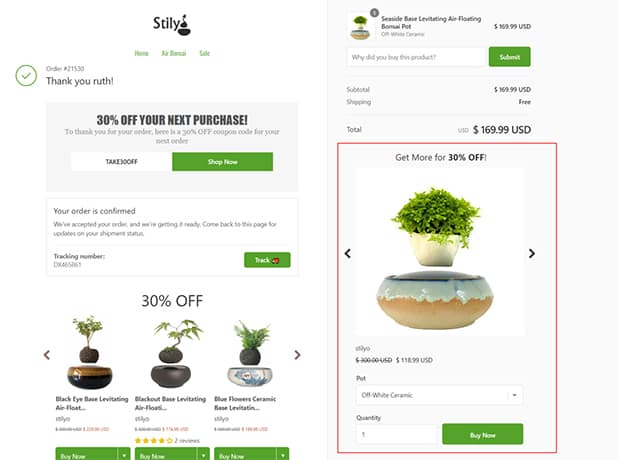
Optimize Thank You Page
Thank you page is the last page that a customer sees after they make a purchase. Optimizing this page is usually an afterthought to most eCommerce website owners, but this is the best time and place to offer an upsell to increase AOV(Average Order Value).
For example, you can offer a discounted price for a related product or even a subscription service. According to studies, up to 50% of customers will buy an additional product after making a purchase.
The most common upsell offer on a “thank you”- page is a discounted price for a related product. Some upsell apps allow 1 click upsells which can be super effective in increasing AOV.
Create Urgency With Timing-based Deals
One way to create urgency for your visitors is to use timing-based deals. For example, you could offer a discount for the next 24 hours or for the next 10 purchases
Use Currency Converter
If you are selling to multiple countries, make sure you are displaying the prices in the currency of the country you are selling to. Displaying prices in the wrong currency can deter a percentage of potential customers from buying from you. You can find use a currency converter on the Shopify app store.
Enable A Search Bar
If you have a lot of products and categories on your website, it’s a good idea to enable a search bar. This will help customers find the products they’re looking for quickly and easily. You can find search bar apps on the Shopify app store.
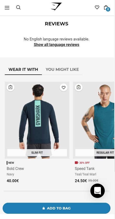
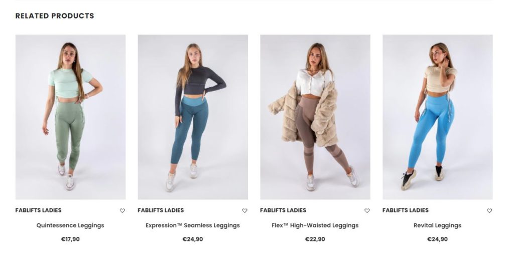
Include Related Products
Make sure you are displaying related products on your eCommerce website. This can help increase the average order value (AOV) of your customers. Related products can be displayed in a carousel or as a grid. Related products are usually categorized by tags, so make sure you are using the correct tags for all of your products.
Optimize How You Display Prices
How you display your price points can make or break transactions. Managing pricing display is one of the most important levers in your eCommerce site. You should test these changes to find what works for you.
Here are some of the tips for optimizing prices on your online store:
- Strip out extra characters (e.g. 200 instead of 100.00).
- Make the current price in bold and easy to find.
- Tuck a smaller price into an insignificant position.
- Drop a whole number if possible (e.g. 99 instead of 100).
- Divide the price when it’s a subscription or something similar (e.g. 10 a month, instead of 120 a year)
- Make Sure all Prices are Including Tax
- Test adding higher prices to products that will not sell well to make other choices more attractive.
Offer Discounts Strategically
Offering discounts can be a boon to increase your conversion rate, but you need to use them strategically. If you offer discounts all the time, your visitors will become desensitized to them and they will lose their effectiveness over time. That’s why it’s important to introduce some kind of limiting factor to your discounts – for example, a time limit, a purchase limit, or a limit to a specific category of products.
Here are some general tips on how to use discounts:
- Offer discounts to people who have already added products to their cart.
- Offer discounts for a specific category of products.
- Offer discounts for a limited time period.
- Offer discounts for purchases above a certain amount.
- Offer discounts for bundled products ( Add 2, Get 30% Off )
- Don’t offer discounts that are too large (more than 50%).
- Offer discounts as a reward – after making a purchase, for sharing a review, etc.
- Try discounts that are automatically applied when the customer adds a product to their cart.
- For products under 100 dollars/euros, present the discount in terms of percentages, as that will be a higher number than the dollar amount saved.
Always test your discounts to see what works best for your store.

Show How Much Money They Save On Discounts
Instead of just displaying the percentage value of a discount, show how much money the customer will save. This will help them to better visualize the value of the discount and make them more likely to buy.
For example, “$100 off – now only $399!” is more effective than “25% off.” The reason why it works is that human brains have adapted to think in terms of tangible values rather than abstract concepts(% calculations take more brainpower!).
Include a Terms of Service and Privacy Policy Page
Make sure you are including a Terms of Service and Privacy Policy page on your eCommerce website. This will help protect you from any legal issues in the future. You can generate a Terms of Service and Privacy Policy page for free using Shopify’s legal templates.
Include an About Us page
Including an “About Us” page on your eCommerce website is a great way to build trust with your potential customers. They will be able to learn more about your company and who is behind it. This page can also be used to showcase your company’s mission and values. A well-written introduction can help to increase eCommerce conversions.

Include a Frequently Asked Questions (FAQ) page
If you are selling a product or service, it’s likely that you will have some questions from potential customers. Including a FAQ page on your eCommerce website can help answer these questions and increase the conversion rate of your website.
Include a Contact Us page
Including a Contact Us page on your eCommerce website is a great way to provide customer support. It also builds trust with your potential customers.
Make Sure All Product Images are of the Correct Size
Resizing photos of your product page can help to decrease load time and make the page look more coherent and trustworthy. All product images should be of the same size, otherwise, they can create a messy and unprofessional look.
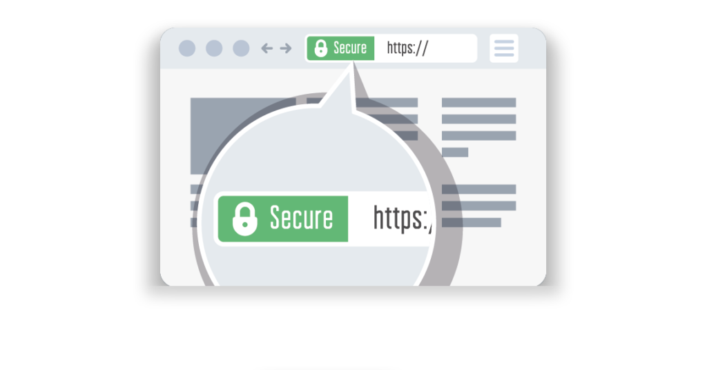
Make sure you are using an SSL Certificate
If you are collecting any kind of sensitive information from your customers, such as credit card details, it’s important to use an SSL certificate. If you are using Shopify, this security feature will be built into your stores once you buy a domain from them. If you buy domains from other service providers, you will need to make sure that the security certificate is set up correctly.
Get Rid Of Outbound Links
If you direct paid traffic to your landing page, you don’t want people to click away from your website and lose a potential sale. For that reason, remove any links within your landing page, that direct outside of your domain. Also, make sure you fix any broken links within the website.
Big brands can get away with adding their social media links to their eCommerce site, but if you are just starting out or testing products, it’s best to avoid losing any more traffic than necessary and remove all social media links.
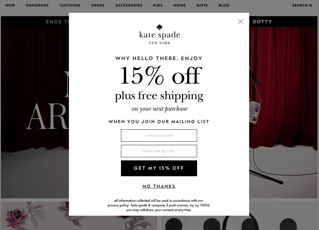
Do Not Use Popups In The First 30 Seconds
Collecting e-mails with popups might seem like a good idea at first, but it’s actually a distraction for most people. In the first 30 seconds of arriving on your website, people are trying to figure out if they are in the right place.
If you have a popup, it will most likely deter them from staying on your website. Wait until people have been browsing your website for a minute or two before asking for their e-mail address. If possible, set up an exit-intent popup, which will be activated when a person is about to leave your website.
Avoid Wall Of Text
First of all, it just looks unprofessional. Having a wall of text on your website will discourage people from reading. As a solution, split text Into 1 – 3 sentence paragraphs so it’s easy to read. Your conversion rate will thank you for it!
Leverage directional icons
Directional cues are an excellent way to guide your visitor’s attention right to where you want them to be. Now I’m not talking big flashy disco lights and cheesy 90-s era graphics, oh no.
Subtle, but powerful lead-in arrows and images of people looking in the direction of your call to action are an effective way to direct that previous attention. Another way to direct attention is via the use of hand pointer emojis (yes, the same ones we use on Facebook).
They don’t have to be loud and tacky to make an impact. Directional cues can help guide people’s attention to where you want it to be, towards that sweet conversion action.
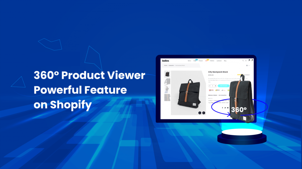
Use 360 View
If a picture is worth a thousand words, then a 360-degree product image is priceless. A 360 product viewer is any digital view of a product that shows it from all sides and angles.
It can be in the form of an interactive image, 3D model, a GIF, or even a video. Including a 360 view of your products on your eCommerce site can help increase the conversion rate, as potential customers will be able to get a better idea of what the product looks like.
This is especially useful for all visual products like clothing, jewelry, and furniture. For Shopify, you could use the app called “Magic 360 spin” to get started.
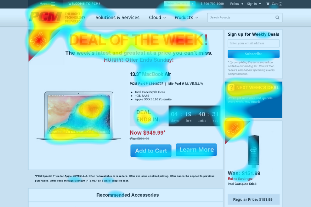
Make Use of Heat Maps
Heat maps are another great way to optimize your website for higher conversions. They allow you to see where your visitors are clicking and scrolling on your pages.
This information can help you to determine which areas of your page need more attention and which areas are performing well. You can also use this information to create a seamless user experience for your website visitors. There are a number of different heat map tools that you can use, the most popular being Crazy Egg and Hotjar.
Use Bold Wisely To Emphasize Key Benefits
In these digital times where attention span is increasingly scarce – approaching the likes of a goldfish, we need to be especially mindful about the use of bold text. Most of your visitors just ‘skim’ your landing page quickly, without much focus and attention to detail.
Whether they’re reading on a mobile device, are in a location with distractions, or are short on time, they want to understand the value proposition, main benefits, and the offer as quickly as possible. Utilize text decorations such as bold, italics, and underlining, along with a variety of font sizes and colors to induce a punch to the main phrases on your eCommerce site.
Bold words and phrases that evoke emotion or ‘speak’ to the end-user as it’ll help to pull them in. It’s easy to overdo it, so be mindful about the balance too – use 1 – 2 text decorations per section.
Add A Blog
Having a blog post section on your eCommerce site increases your perceived authority in the niche, and it also helps to keep your website visitors engaged for a longer period of time. This is because blog posts are generally longer than product pages, and they also offer more value to the reader.
By adding high-quality blog content, you can increase the likelihood of getting leads, subscribers, and even customers.
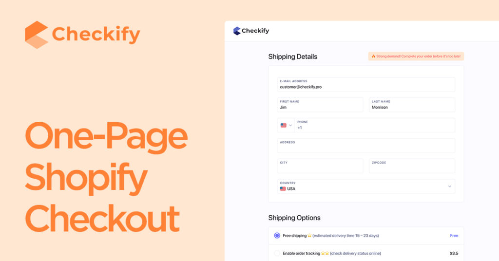
Use a one-page Checkout Solution
Checkout is the last step in the buyer’s journey, so it’s incredibly important to optimize this part of the website. One-page checkout is a checkout process that takes place on a single page, as opposed to multiple pages. This makes the checkout process shorter and simpler, which can lead to a higher conversion rate. We recommend Checkify.pro checkout page for Shopify users.
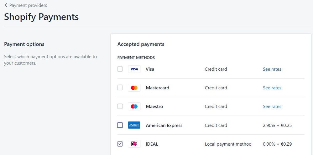
Offer Flexible Payment Options
Depending on the country you sell to, different payment options will be more popular than others. Offering a variety of payment options can help you to increase your conversion rate, as potential customers will be able to find a payment option that best suits them.
Popular payment options vary by country, so it’s important to research what the most popular payment methods are in your target market. One of the trends in 2022 and going forward is pay-later services. This will include the likes of Afterpay, Klarna, and Zippay.
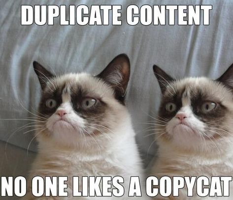
Avoid Duplicate Content
Duplicate content can hurt your website’s SEO and can lead to a decrease in your website’s ranking on search engines, thus decreasing traffic and sales. One way to avoid duplicate content is to use canonical tags. Canonical tags tell search engines which version of a URL is the original, and which versions are duplicates. This can help to avoid any penalties from search engines for having duplicate content on your website.
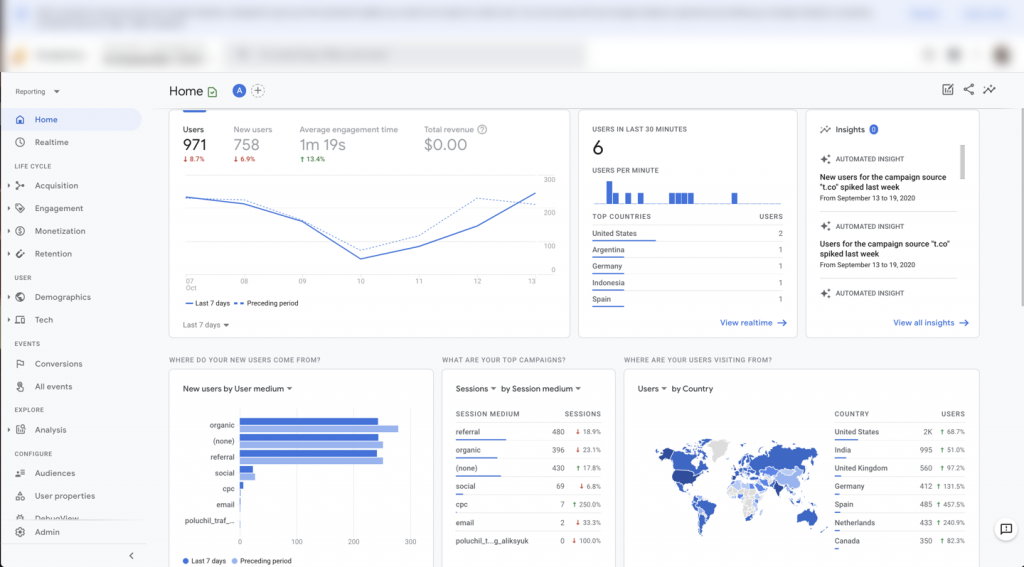
Integrate Google Analytics
Although Google Analytics does not directly help you increase conversion rate, it is a great tool for understanding your website traffic and how to improve it. With Google Analytics, you can track a variety of different metrics, such as where your website visitors are coming from, how long they are spending on your website, and what pages they are visiting. This information can help you to determine which aspects of your website need improvement in order to increase your conversion rate. You can also use this information to create targeted ads and marketing campaigns.
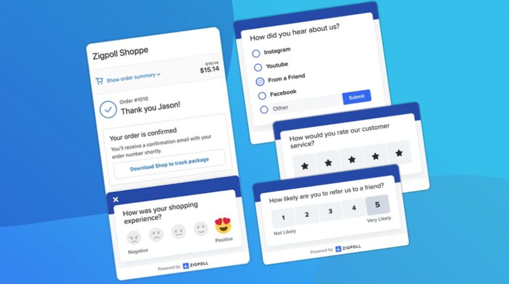
Double Down On Customer Feedback
What’s a better method of understanding what customers want than actually asking them? Use surveys and feedback forms to get feedback from your customers about their experience on your website. This information can help you to improve the user experience on your website and increase your conversion rate. You can also use this information to create targeted ads and marketing campaigns. You can use eCommerce survey apps such as Qualaroo and Hotjar to collect feedback from your customers.

Conduct Regular Website Audits
It might be boring and tedious work, but conducting regular website audits(like once every few months) is one of the best ways to optimize your website for higher conversions. By auditing your website, you can identify any issues that need to be fixed. You can use this information to determine which areas of your website are performing well and which ones need more attention.
The more topics you decide to examine in your audit, the more findings you’re likely to discover. You may choose to do the entire audit at once, break it up into chunks, and create an audit schedule.
Make a checklist for your audit.
Here are some of the items you should put on it:
- Are all of the pages and images loading correctly?
- What is the page load speed?
- Do all of the links go to the correct destination?
- Does the navigation work across all devices?
- Does the site load and work on different browsers?
- Are there any grammatical or spelling errors (pro tip: use Grammarly)?
- Is all of the content up-to-date?
- What does your 404 error page look like?
- Have 301 redirects been appropriately implemented?
- Are the search results for in-site queries correct?
- Do the product pages have relevant content?
- Is there a robust system of internal linking?
- Are the right related products showing up during browsing?
- Are the product images high-quality?
- Are your abandoned cart triggers working correctly?
- How much time does your team take to reply to a customer question?
- Is the customer service team effective at resolving the issue?
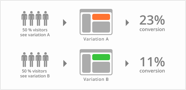
Importance Of A/B Testing
A/B testing, also known as split testing, is a method of comparing two versions of a web page to see which one performs better. With A/B testing, you can test individual elements of your website, such as the layout, the design, the call-to-action buttons, offers, titles, and product descriptions.
By using A/B testing, you can determine which version of your website is more effective at converting visitors into customers.
There are a number of different A/B testing tools that you can use, such as Optimizely, VWO, and Google Experiments. Testing is a continuous process and you should always be testing new ideas to see if they improve your conversion rate.
In Conclusion
With ads increasingly more expensive, it’s more than ever viable to optimize your eCommerce site in 2022.
So, if you want to see an increase in your eCommerce conversion rate, start by making small changes to your website and testing them. And remember, even the smallest change can make a difference – it might not be noticeable at first, but over time those tiny improvements will add up.
If you’re looking for help increasing your conversion rate, we at Adacted would be happy to assist. With years of experience in Facebook and Google advertising services, we know how to optimize your website so that you see a real improvement in sales. Contact us today to learn more!